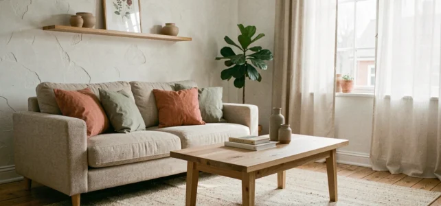
Designing a home that reflects a personality rather than a catalog of trends requires making choices about materials, colors, and layouts that stand the test of time. Current decorative orientations value raw materials, enveloping palettes, and handcrafted pieces, but their concrete implementation raises questions that generic guides rarely address in depth.
Raw and Recycled Materials: What Choosing Wood or Stone Really Implies
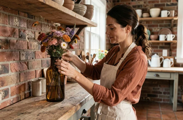
The return of recycled wood, stone, rattan, and linen in interior decoration is no longer just a passing trend. These materials are now presented as pillars of an eco-responsible approach to design, with a dimension that goes beyond mere visual appeal.
Recycled wood, for example, presents constraints that are often underestimated. Its previous treatment (paints, varnishes, fungicides) can pose compatibility issues with certain contemporary finishes. Before incorporating it into shelves, kitchen countertops, or headboards, it is essential to check the origin of the boards and their treatment history.
For those wishing to explore handcrafted creations incorporating these materials, you can visit the home page of Cœur Artisan to compare different implementation approaches.
Natural stone (travertine, slate, Burgundy stone) requires specific maintenance depending on the intended room. In the kitchen, untreated porous stone will absorb grease stains within weeks. In contrast, in a living room or entryway, this same porosity creates a patina that enhances the character of the space.
Immersive Colors in Interior Decoration: Beyond the Color Chart
The current decor trend emphasizes immersive colors and enveloping palettes rather than the neutral shades that dominated the previous decade. Deep terracottas, sage greens, and petrol blues are gradually replacing gray and off-white as dominant colors.
This evolution poses a concrete problem: painting a wall in forest green or terracotta does not produce the same effect depending on the room’s exposure. An immersive color in a north-facing, poorly lit room can turn oppressive and dark. The same shade in a room bathed in natural light creates the desired enveloping effect.
Test Before Applying: The Limitations of Samples
Paint samples of just a few square centimeters do not allow for a proper judgment of a saturated hue. Applying a swatch of at least one square meter, letting it dry completely, and then observing it at different times of the day remains the most reliable method. Field feedback varies on the usefulness of digital simulation tools, which struggle to convey the true depth of saturated colors.
A point rarely addressed: saturated colors amplify wall imperfections. Cracks, poorly sanded plaster joints, and surface irregularities become much more visible under a dark green than under white. Planning for more meticulous preparation work avoids disappointments.
Local Craftsmanship and Unique Pieces in Home Design
One of the most notable developments concerns the place of local craftsmanship and unique pieces in building a decorative identity. The logic of “character” takes precedence over uniformity, changing the way furniture and accessories are purchased.
In practical terms, this means accepting that two chairs around a table may not be identical, that a handmade ceramic light fixture may have slight variations in shape, or that a solid wood piece may bear the marks of its crafting. This aesthetic choice does not suit all spaces or all sensibilities.
How to Spot Quality Craftsmanship
Several criteria can help distinguish an authentic handcrafted piece from an industrial “handmade effect” product:
- Transparency about the workshop and the artisan’s name, verifiable independently
- Irregular but consistent finishes (an isolated flaw is not a sign of craftsmanship; a uniform texture in its irregularity is)
- The possibility of customization, even minimal (choice of color, size, finish), indicating small-scale production
- A longer delivery time than average, indicating that the piece is not stored in a warehouse
Light and Furniture Arrangement: Two Underestimated Levers
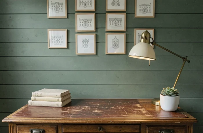
The multiplication of light sources is a common piece of advice, but its application often remains superficial. Three light sources at different heights in the same room transform the perception of space much more than a central ceiling light, no matter how stylish.
Low lighting (table lamp on a piece of furniture, floor reading lamp) creates an intimate zone. Intermediate lighting (wall sconce, low hanging light above a table) structures the space into functional areas. High lighting (ceiling light, recessed spots) serves as accent light, not main light.
Furniture Arrangement: Circulation Takes Precedence Over Symmetry
Placing a sofa facing a wall with a centered coffee table remains the most common reflex. However, positioning the sofa perpendicular to the wall or at a slight angle creates natural circulation and a less rigid living space.
The rule to remember:
- Leave at least the width of a comfortable passage between each piece of furniture and the nearest wall
- Avoid pushing furniture against the walls in a large room, which visually enlarges the space instead of shrinking it
- Group seating around a focal point (fireplace, window, bookshelf) rather than around the television screen
Decorating an interior with style and authenticity relies less on accumulating trendy objects than on technical decisions regarding materials, light, and layout. A well-prepared wall before immersive painting, a handcrafted piece with known origins, thoughtfully layered lighting: these discreet choices create a space that resembles its inhabitants rather than a standardized interior.